
Today I am sharing my first A England! Woooo! My nail polish BFF Caitlin always, always gushes about A England the same way I gush over Rainbow Honey so I decided to take a dive into some A Englands the last time I placed an order with Nail Polish Canada. Here A England Tess d'Urbervilles, which I believe is named after one of Thomas Hardy's novels entitled "Tess of the d'Urbervilles: A Pure Woman Faithfully Presented". I am not going to pretend that I actually know this novel thoroughly so instead I am going to link you to the Wikipedia page, hehe. A England Tess d'Urbervilles is a vampy seductive deep forest green with hints of radiant green shimmer, peeking out from the dark abyss.
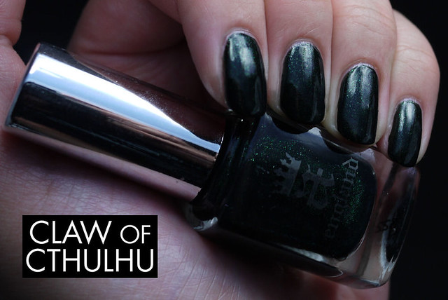
Formula-wise, it applied evenly in two coats. I found that it dried with a very dull finish so I topped it off with some Seche Vite and the glossy touch was needed to bring Tess d'Urbervilles in all her glory. I really, really love the A England bottles and am starting to fall in love myself so I hope I don't feel any weird urge to collect them all just as I do with Rainbow Honey, haha!
OK now for some real talk. About photos.
Typically I've photographed my swatches to showcase the polish. Colour-wise, I don't shoot to flatter, I don't correct the saturation or hue, or change the colour. My goal is to make the polish as colour accurate as possible. On the flip side of things, my skin tone is not colour accurate. I always thought to showcase the polish, but would you find it useful to see how the polish compares against my weird Asian skin tone? Does it matter?
Technically speaking, I shoot my photos with a compact camera - a Panasonic Lumix GF-1 with a 20mm f/1.7 - into a DIY lightbox made with a transparent Rubbermaid storage container, with black posterboard lined on the bottom and back, lit with 4 desktop lamps with white compact fluorescents. (Wow, I totally felt naked for a moment there, haha.) I usually leave my camera set to AWB (automatic white balance), which is fine - but I find the GF-1 to naturally shoot a bit "colder" on the automatic white balance setting. I experimented by "calibrating" my white balance to base itself on a white piece of paper and then well... Here are the results:
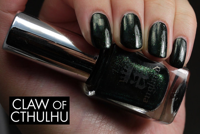

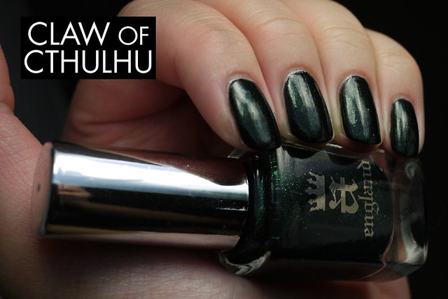

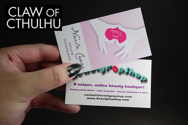
And just to compare to some white business cards:
I would ABSOLUTELY LOVE it if you could give me any feedback whatsoever on how you feel about my photos here on the blog. I do have quite a bit of backlog photographed the way I usually have been - but would you rather see how my Asian skin tone stacks up against the polish shade? Also - do you have any A Englands? Are they a "Pokemon" polish company where you gotta catch em all?
I'd go for the most colour accurate photos, polish-wise, really.
ReplyDeleteI dunno, I've been struggling with this too. If I compare a few of my swatches my skintone is all over the place, but as long as the polish looks okay, I'm fine with my hands looking slightly different. I have no idea how some bloggers get their hands/skintone to look identical in every photo, and to have the polish be accurate!
I don't have any A England /yet/, they look amazing but they're so expensive :c -long comment is long-
I guess essentially I am playing with a manually set white balance than an auto white balance. A good way to do it is to set the camera to be using the same settings and then have one photo of you holding something that is pure white. Then when you post-process your photos, you can edit the colour to base the photo's colour balance to the white card.
DeleteI honestly don't see a huge difference between the two images - the polish is still pretty much coloured accurately, other than one being in more white light, and the other toned slightly warmer, which warms my skintone. Everything looks different in different light so I just get confused with which direction I want to go in. The only polish that I have a hard time photographing is actually holographic nail polish - still trying to figure out a way to do those!!!
Yeah A Englands are expensive, which is why I only got a couple and only because they were on sale. :S
I would go with what is more colour accurate. That being said, my personal preference is the second set of pictures, it brings out the green better. But I also have this polish and know how hard it is to photograph! I use a Panasonic Lumix FZ100 and for my nail pictures I put it on manual setting and play with the shutter speed. I find my colours are more accurate now and from post to post my skin tone is more the same too. On my blog if you click on All About Nails, then on Swatches and Reviews, you'll see that in the top row my skin is pretty much the same in all pictures, but for the rest it varies slightly. Also, sometimes from one picture to another (for the same post) the overall colour is different (one might be cooler than the other), so I take the one that is the best colour accurate and slightly touch up the other ones so they are the same.
ReplyDeleteI have 4 A Englands, all from the Gothic Beauties collection (I skipped on the silver one). I find them a bit dull on the nail and you definitely need top coat for these. But I've seen other colours (mainly from Caitlin) and they are GORGEOUS! It's just too bad that they are a bit pricy.
For me, I am struggling with the idea of what is "colour accurate" because to me, accuracy can be skewed by people playing with the saturation, exposure, hue especially - so I consider both sets to actually be "colour accurate" only because in sterile white light circumstances, that is what it will look like - however, in a natural neutral environment, it wouldn't look that way. Anyway, I guess that's where I am struggling and I am not sure what people want to see. My boyfriend and my brother both think the second set is better because apparently this whole time, my "hands look dead" - LOL thanks guys! (I guess boys don't care about this stuff, lol.)
DeleteI just got the new collection and my mum really liked the red so I guess we'll see how I like them. I was thinking about getting some others from the gothic beauties collection with my NPC points though - maybe I'll look out for your thoughts on em! :)
Yeah I know what you mean when you say they are all colour accurate - it all depends on the type of light that you use. And some polishes will look very different from one light to another. For me I try to get the camera to reflect best what I see when I look at my hand in the light box. If the picture on the camera display "feels" the same, then that's my shot!
DeleteOh boys, lol!
I'll probably swatch the Gothic Beauties this fall, I still have lots of pastels to go through. I already did them last year on my Instagram, but I definitely need to redo them for my blog.
I had probably a one hour conversation about colour with my friend last night who is completely out of the nail community and he mentioned that whatever "feels" right, I should go with - so I am going to go with it! I definitely don't "feel" the white sterile light. When I buy a polish, even in the store, there is a little more yellow or tungsten in their lighting rather than operating room lighting and I certainly don't live with crazy white lighting at home wither so I am going to roll with it. I do have some backlog with the "dead hands" haha but moving forward, I am going to include photos to have my skin tone. #italktoomuch
DeleteOhmygosh, loving these polishes to much! The sparkle, the colors - my inner magpie is going bezerk!! Personally I like the lower photos, I feel like they capture the true color of the polish better. Hard to really convey the complexity of the holos with a digital camera, but your photos look beautiful!
ReplyDeleteThank you SO much for the feedback! So far I am feeling a general consensus to go for a natural light white balance rather than the white light sterile so I might be looking into it for future posts. I will continue doing both this week and then after that, I may be doing just one light setting rather than two, hehe. Both sets are colour accurate but for me - I just don't know how often we are hanging out in white light! I'm not always in the operating room, LOL.
DeleteI do not have any A Englands, but I LOVE this post :) Very very awesome. I noticed my skin usually doesn't look it's true color in swatches...maybe I should experiment :)
ReplyDeleteIt's all in the white balance! I definitely go through it in great detail above but it really has to do with whether your camera can calibrate a white balance, and if you are using any post processing software to "tweak" the colours. Like I said, I don't tweak my images to make polish look better or worse than it is! If you experiment, let me know - I'd love to see your findings too!
DeleteAlso, I don't think your skin tone is strange at all. The natural light version looks a lot like my hands, and I'm a "must buy the lightest shade of foundation" pale white girl with yellow undertones, so seeing how the colors play with your skin is actually super helpful. I had a lovely hot pink polish (Ditz from Different Dimension) that unexpectedly clashed really horribly with my skin (luckily I have a friend it looks great on). The more diversity in skin tones in swatch blogs the better, IMO.
ReplyDeleteHaha I always thought my skin tone was weird but maybe I am used to photographing with the white balance set to auto - seeing some yellow makes me think I'm making a mistake so this will take some getting used to!
DeleteThanks for all your comments and feedback, it really does mean a lot to me that I'm getting other's thoughts - I am just trying to improve! I guess I am new to all this and I want to create something useful for everyone who stumbles upon this little nook of the Interwebs. :D