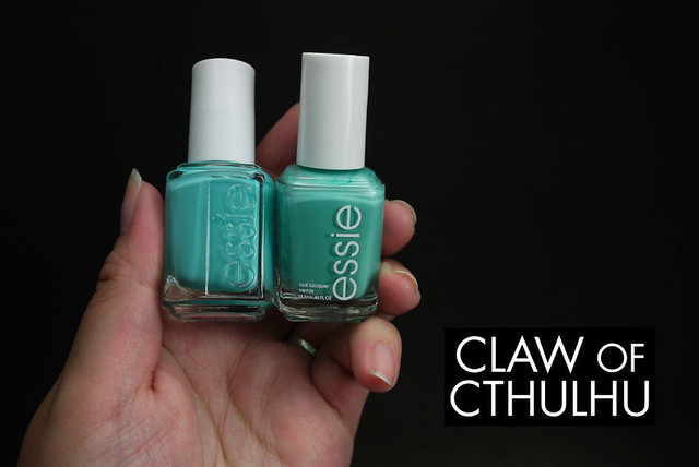
So here we go! Obviously whenever Essie comes out with a new turquoise, teal, pastel "tiffany-esque" blue, I am sold. I am a sucker! So when I saw Essie In The Cab-Ana, I just did it anyway.... But one second, don't I have something like this? Even recently from the Winter 2012 collection? Wasn't it called Essie Where's My Chauffeur? Well, let's take a look here. (With the white photos first...)
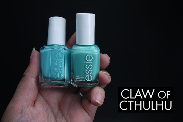
One thing that Essie has done more recently is the bottle change. I personally don't like them. I could do without the molded branded bottles, and especially the fact that they moved the name label from the top of the bottle to the bottom - Gah, not very Helmer-friendly! I like seeing all the names of my polishes from the top! Personal preference, but I don't like them.
Now how's about the actual shades? Well, see for yourself - I'll let you take a guess at which one's which:
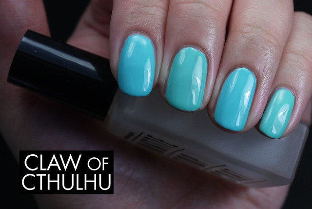

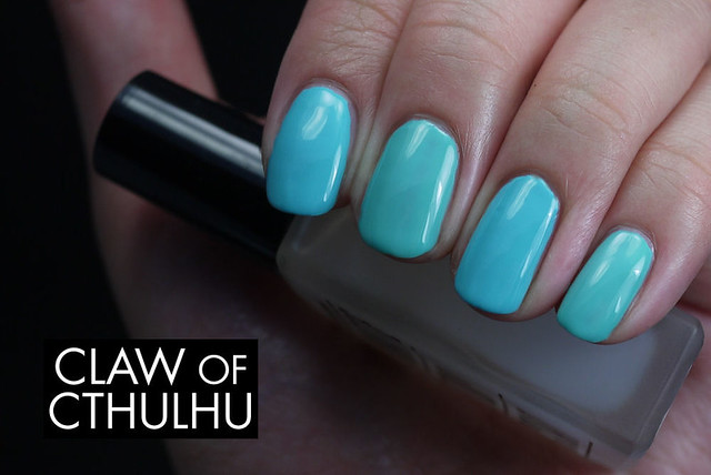
Did you get your guesses in? Let's see if you're right:
The index and ring finger and sporting two coats of Essie In The Cab-Ana and the middle and pinky fingers have Essie Where's My Chauffeur. Did you get them right? Give yourself a pat on the back! (Oy, not that hard!) So formula wise, they both cover in two coats, however In The Cab-Ana is SUBSTANTIALLY thicker. In a not so great way. It was workable, but definitely not my preference! I know many others don't take issue with the formula but maybe I'm just being picky. I definitely prefer the smoother formula of Where's My Chauffeur.
Shade-wise, you can easily see that they come from the same family, however In The Cab-Ana is much brighter, and Where's My Chauffeur has more mint undertones and more of a dusty feel. I've seen In The Cab-Ana described as dusty, but I associate dusty with some desaturation and I think In The Cab-Ana is super vibrant. As much as I love these kinds of shades, they both definitely better suit a more fair skin tone, as you can see it sort of clashes with mine.
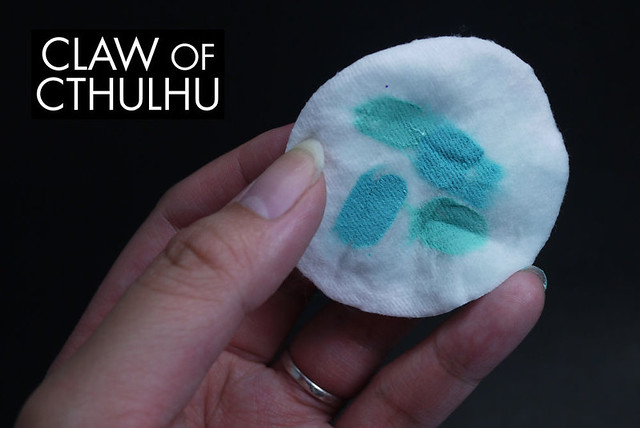
Here's my removal pad:
And here's the same photos from above, but in my "new and improved" white balance settings - (I like them a lot better and think I should have probably led into this post with them. Oh well.):
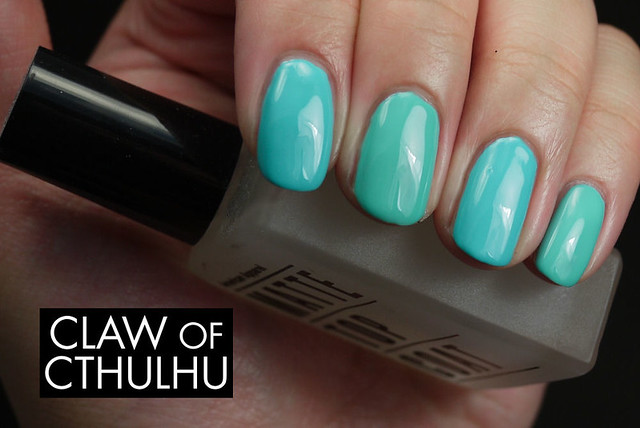

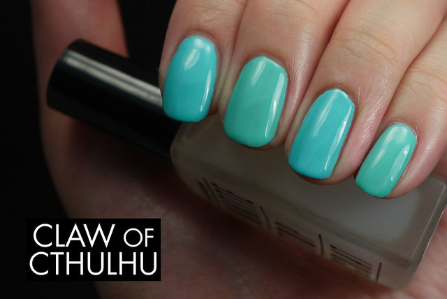

So as you can see, both finish in gloss quite nicely. All the swatches above do not have a top coat - it's all in the formula!
Do you have a preference in this family? If you own In The Cab-Ana, did you take issue with the formula, or is that just me being picky? (Is anyone else totally hooked on Animal Crossing: New Leaf? LOL.)

These are both beautiful and they have a gorgeous finish on their own! I don't own any of these, but I've been itching to get Mint Candy Apple. However, I find them expensive and I haven't had the best of luck with Essie, formula-wize, so I'm hesitant to grab it. And the fact that mint green/pastel turquoise is becoming the #1 colour of my collection... do I really need another one? Obviously no, but you know how us polish addicts are... must... buy... all... polishes!
ReplyDeleteThank you for this comparison!
I hate to say this but Wal-Mart is the cheapest source for Essie, unless you have a big enough order to get free shipping from Nail Polish Canada. I don't know what it is, but I just can't justify spending more than $7 on Essie, LOL. (Says the girl with a $15 Enchanted Polish, right? Haha.)
DeleteAs a fellow mint/pastel turquoise enthusiast, I think these might be skippable! (I do favour Where's My Chauffeur though. ;))
Claw Of Cthulhu: Essie In The Cab-Ana Vs. Essie Where'S My Chauffeur Comparison Swatch Review >>>>> Download Now
Delete>>>>> Download Full
Claw Of Cthulhu: Essie In The Cab-Ana Vs. Essie Where'S My Chauffeur Comparison Swatch Review >>>>> Download LINK
>>>>> Download Now
Claw Of Cthulhu: Essie In The Cab-Ana Vs. Essie Where'S My Chauffeur Comparison Swatch Review >>>>> Download Full
>>>>> Download LINK YE
They are both so nice and glossy! I prefer the slightly more blue in the cabana, but given the formula I don't know which one I'd pick. I just picked up naughty nautical so I do have at least one in this family :) my naughty nautical bottle, which i assume is brand new, has the molded essie on two sides and the normal white writing on one. It also still has the product name on top, which i thought was nice, my old essies don't (they just have the e) so I'm not sure if the changes you found are consistent or just that batch or what, it seems strange. sorry for all the lower case haha i'm letting naughty nautical dry still as i type which makes proper punctuation hard! hopefully i'll have my swatches up asap so you can compare and be convinced to buy it, it's actually very different (from these two at least!)
ReplyDeleteenjoy your animal crossing!
I was so tempted to get Naught Nautical, so I hope I can just live vicariously through you!
DeleteI checked my bottles last night - I don't own a lot of Essie - but all my bottles from 2011 have the white screened label and then the chromes (Summer 2012) have the molded bottle and cap - (Winter 2012) Where's My Chauffeur has the printed label and name sticker on top and lastly (Spring 2013) In The Cab-Ana has molded bottle and cap top. What is going on?! So inconsistent!!! D:
Hmm yeah I see a very slight difference, but they're really very alike! I'd say getting just one of these would be fine :-)
ReplyDeleteI would have to agree - I favour Where's My Chauffeur most definitely! :D
DeleteI showed my husband the Instagram pic told him "those are two different colors." He stared at my phone for a long time, then said he likes your blog name.
ReplyDeleteBahahaha this is the best comment!!!! I also love how our boys totally don't see the subtle colour change, it's always hilarious and the eye roll that follows after, haha. Glad your husband gets my blog name!!! :D :D :D
DeleteI'm such a sucker for anything that is aqua, turquoise, sea foam, etc. I love them both! Though the colors are similar, I think they are unique in their own way. Not sure why they consider Cab-Ana "dusty". It's so bright and vibrant. I think of Fall muted tones when it comes to the word "dusty". I am sorry to hear that it was thicker. Just makes it so difficult to paint properly, especially with your opposite hand or in humid weather. I noticed that the bottles are different, but I do prefer the label of the color on top. They should keep that consistant.
ReplyDeleteSide note! Totally addicted to Animal Crossing: New Leaf!!!!! Trying to expand on my house and change the decor on the outside. I have yet to go to this island. I will have to spend some time to figure that out. Did you enjoy the long sunny day on June 21? It was so bright all day/night!
This is totally my krytonite - I just can't help it! I even want to get Essie's Naught Nautical and it's totally on the same lines as this (but not quite; which makes me want it, lol!)... I don't mind the molded bottles but if they just kept the label on top! Man that would help! I could care less about the molded "e" logo on the top, ugh.
DeleteI am SO addicted to New Leaf... I have 1.6M Bells in my bank account, just ready for the next house expansion and city public works. I am also going to get my Kicks shop soon which hopefully means I can get Shampoodles! I am so sick of the "standard issue" (lol) brown hair and I can't wait to get my blue hair and pigtails, LOL. I would definitely recommend going to the island - I do a few laps around the beach on my island catching rare beetles (between 8000 and 15,500 bells) and sharks before I go to sleep and get 300K Bells with each trip. Seriously worth it. (I'm crazy.)
Manoj Taxi Service Goa Reliable and comfortable taxi service for local and outstation trips Call now 9822334611. Manoj Taxi Service Goa
ReplyDelete