
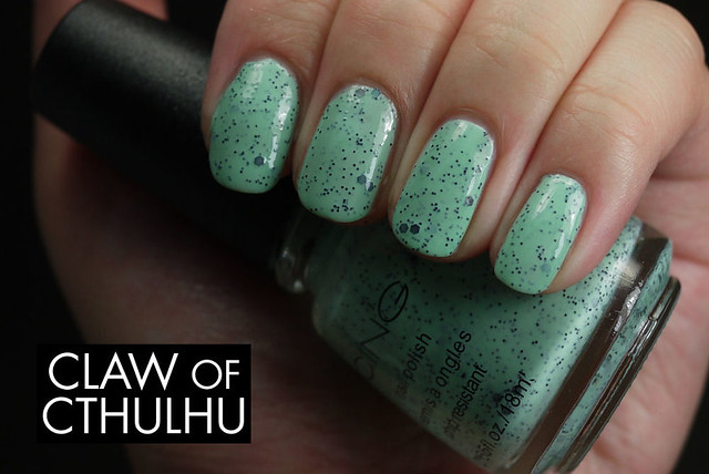
So today I've got Icing By Claire's Mint Choco Chip which might LOOK FAMILIAR? Illamasqua Mottle, sort of right? I'll post the photos after the Mint Choco Chip jump but asides that, it is a mint green creme jelly that has solid black micro glitter and sparse hex glitters. Formula wise, it's awesome! Full coverage in two coats, and a no mess application. Here's my swatch:
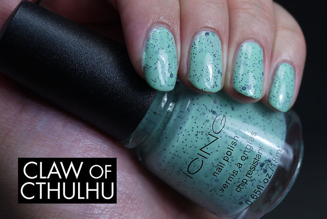
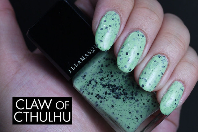
I love it. Especially for the price, it was so worth it. Now while I don't own the Illamasqua Mottle to do a direct comparison, I think Mottle maintains a mint tone, but is slightly warmer and yellow tone leaning than Icing by Claire's Mint Choco Chip. So as it turns out - the two aren't dupes! (Just recalling from memory here.) Here's Illamasqua Mottle in case you've forgotten (you can read the full review here):
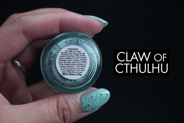
(Waaah, I miss my long nails, haha!)
And another thing...
I talked about photos in my post yesterday about revealing how the polish compares to my Asian skin tone. (Read more details here.) I am actually going to continue with this for the next little while until I either get sick of it or once I gain a decent consensus on what my readers (if any, har har) think. So again, here's how Mint Choco Chip compares to my Asian skin tone:
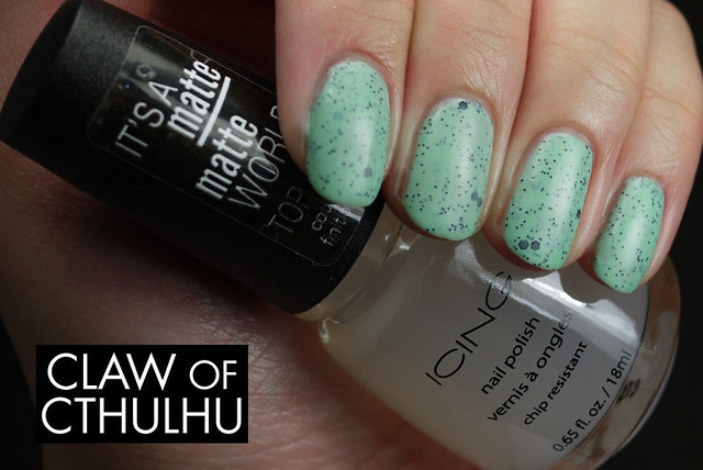
And as a bonus, here's Icing by Claire's Matte Top Coat. I think it's not that good:
So far, I am gathering that most people are favouring seeing my skin tone with the polish. I dubbed my regular photos the "dead hand photos" because the skin tone is fairly lifeless and desaturated with my natural yellow skin tones bleached out by a colder biased white balance. Again, please let me know your thoughts of whether or not I should keep the regular first set, the "skin tone" set (wish I had a better name for them), or if I should just go crazy and do both.
Just to clarify - I am not skewing the colours at all, and both sets are actually "colour accurate". The first set is what everything looks like under the purest white light. The second set is what it would look like in more "natural" light conditions. What do you prefer?
What do you think of Icing by Claire's Mint Choco Chip? Now that you've seen both polishes, would you splurge for the Illamasqua? Or will the Icing by Claire's suffice for your ice cream polish cravings? We'll meet again tomorrow with some swatches from Rainbow Honey!
I prefer the natural light pictures, I think it's the warmth of the pictures that I like best. But I know what you mean by both sets of pictures are colour accurate even though they look different. Ahhh, the lighting issues of photographing!
ReplyDeleteI love this polish! I have not gone to the mall yet, but once I do I don't think I'll be able to pass by Claire's without going in, and possibly buying 2 polishes! Gotta take advantage of that 50% off!! :p
Even though the colour is not exactly the same as Illamasqua, I would buy Claire's over it because of the price. And since you said that this one had a great formula, even better!
After worrying about it for a few days, I am finally going to stick with natural lighting. I thought for a while to post both but I think it would be too exhaustive and maybe even confusing for anyone who stops by on my blog. Only crappy thing about this is that I have to post a backlog now! Gahhhh~~~
DeleteAs much as I hate Claire's (I think they're really tacky), I actually am REALLY surprised I liked this polish! Honestly, the brand just seems "cheap" itself, so I was pretty surprised by how smooth the formula went on, as well as how they've stocked trendy polishes like these in store! I think I might actually prefer this version because I like things to be a little more cold toned, rather than warm toned. (Maybe that's why I had dead hand pics for so long, lol.)
I really admire your swatches, Melissa. I've been seeing them pop up in my FB feed - gorgeous! I would say I like the the natural lighting best. Keep up the amazing job! <3 p.s. And the name of your blog is brilliant!
ReplyDelete*gulp* My Ten Friends? Like the nail polish? (If so, I am a MASSIVE fan and I am so humbled you stopped by! Holy cow. But also, even if you aren't My Ten Friends nail polish, I lurve you anyway for saying hello! HI!)
DeleteThanks so much for the feedback, it's really helping me gain an idea of preference! My goal is to make this blog helpful, insightful, somewhat entertaining so if I can produce photos that will yield my goal, I would be stoked!!!
Haha and thank you! I am glad I went with this name. Can you believe once upon a time when I was first planning and formulating my nail blog, it was going to be called "YVR NAIL SWAG"? Yeeesh I am glad I stuck with my nerdy heart! <3 :3
Haha, yes, My Ten Friends as in the polish company :) That is so awesome that you're a fan - YAY! Lol, that makes my day!
DeleteI am so glad that you went with your nerdy heart. The minute I saw your blog name I had to check it out, and then I saw your swatches and became an instant fan ♥
xoxo
Puhreeeeeetty :-)
ReplyDeleteThis one looks really ... off with the matte top coat. I love that it is two coats and so original though, I may have to stop by Claire's :) Can't wait to see the pink one too and yay for RH week.
ReplyDeleteI'm not good enough with cameras and things to really know what you mean when you are talking about the technical aspect of your photos. I think both look great. It is crazy how 'wrong' the skin tone is in your normal photos, you'd mentioned it before but seeing them side by side, wow.
Not only does it look off, it's just a god awful matte top coat. Not impressed. I picked it up on impulse (I always get suckered in the "buy one, get one half off" and because I already had the other two, I just got this) - I can safely say that I do not recommend it. There are better cheap matte top coats elsewhere.
DeletePutting them side by side, there's a stark difference! Going forward, I've elected to go with photos that include my natural skin tone. I just hope it's a good decision! :)
I have gotten their nail polish before and it super quick to put on. I'll have to check out their collections now for fun colors. I think it goes really well with your skin tone too. The natural lighting and your skin tone give it a warmer tone which makes it minty in my opinion. And I love your photos in a natural light setting. It brings out pops of color in the nail polish that is closer to how it could look in real life. Also that matte coat looks way to thick and really dulls out the glitter.
ReplyDeleteIt really surprised me! I guess I just feel like Claire's has this reputation of having cheaply made jewelry (I remember all my hair clips breaking after one use when I was a kid) - I never would have thought their nail polish would be of any remotely good quality. I'm happy with them! (And the price!)
DeleteMoving forward, I will be including my skin tone and leaving out the sterile white light environment photos. There's going to be an awful transition period where I am posting my dead hand (lol) backlog but hopefully it'll be an improvement! Thanks so much for sharing your thoughts, I am really thankful and appreciative!
I like seeing your natural skin tone, it's not like I'm ever likely to wear polish in pure perfect white light anyhow! Also I agree with the love for the blog name, I'm glad you went with your nerdy heart.
ReplyDeleteI can't even imagine what this blog would be like if it was called YVR NAIL SWAG - I really wanted to incorporate my locale into my nail blog but I feel like doing features and talking about all the local shops and the difference between being a nail polish addict in Canada versus the US is enough. The only downside? No one knows how to spell Cthulhu, lol.
DeleteGoogle's pretty good at figuring out messed-up spellings, though. Also, autocorrect suggests Cthulhu once I get to cth!
Delete